Improving Access to Pharmacy
Elevance Health, formerly named Anthem before June 2022, stands as one of the United States’ leading health insurers, providing an extensive array of health benefit coverages. Starting in 2018 and for more than three years, I provided instrumental UX design guidance, helping to secure Anthem’s prominent position in the online prescription benefits sector.
Anthem – Health Insurer 2018-2021

Challenge
Anthem faced the urgent need to develop a comprehensive pharmacy benefits management (PBM) platform as their partnership with Express Scripts was ending. To meet the high expectations of Anthem members accustomed to Express Scripts’ features, a substantial feature set was required, all within a tight timeline of less than a year. I joined a team tasked with conceptualizing user flows, wireframes, and final design deliverables to fulfill these requirements.
Team
We operated as a cohesive team of five designers, comprising an art director, junior visual designers, and senior UX designers (my role), where I contributed my expertise in transactional flows. My role involved translating early business concepts from product executives into detailed task flows and wireframes.
Solution
We collaborated closely, with each senior designer taking ownership of specific features and serving as the primary liaison for numerous development teams. Back-end constraints regularly forced us to adapt features based on new information which is why we worked iteratively. Post-launch, the platform was a successful MVP, but ongoing commitment was needed to enhance the PBM experience for users.
I partnered with the research team to validate proposed fixes, using high-fidelity InVision prototypes and member feedback loops to inform changes. The quality of experience (qxScore) was elevated to 82 out of 100. This score takes into account behavior and attitude metrics and is impacted by ease of use, appearance, and average task completion. Overall, the experience became cleaner, more understandable, and consistent across various feature sets.
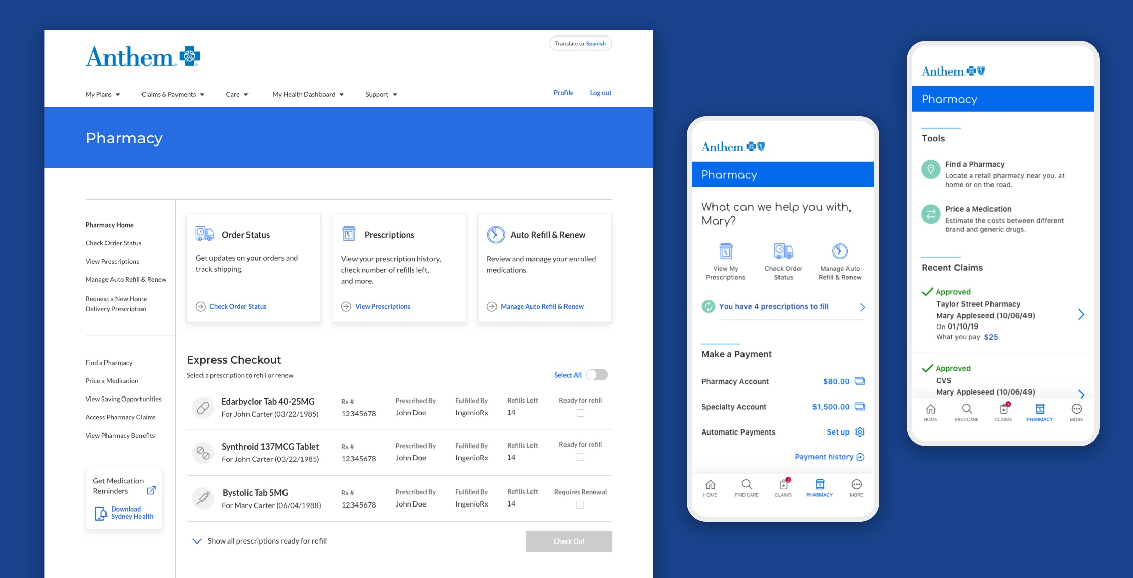
The dashboard links members with pharmacy tools and features, and functionality was adapted for mobile platforms as well.
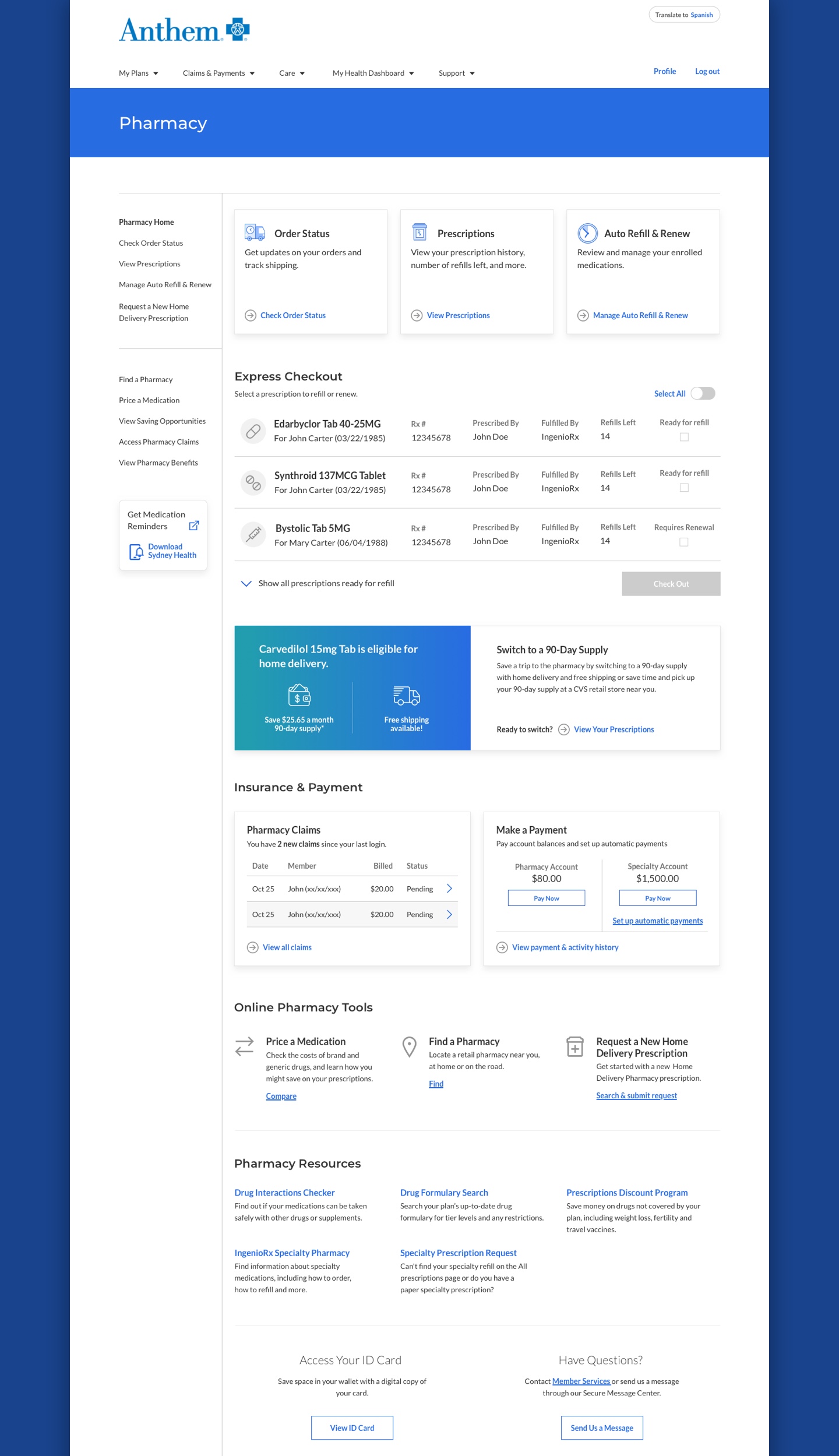
The platform supports numerous tasks to meet member needs. Adding a sidebar navigation post launch greatly improved task efficiency.
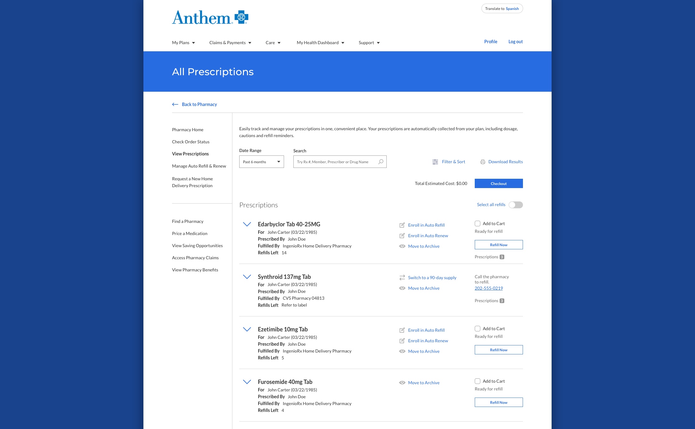
The prescriptions page, a data-heavy hub for refilling and renewing medications, required a nuanced display to avoid overwhelming users.
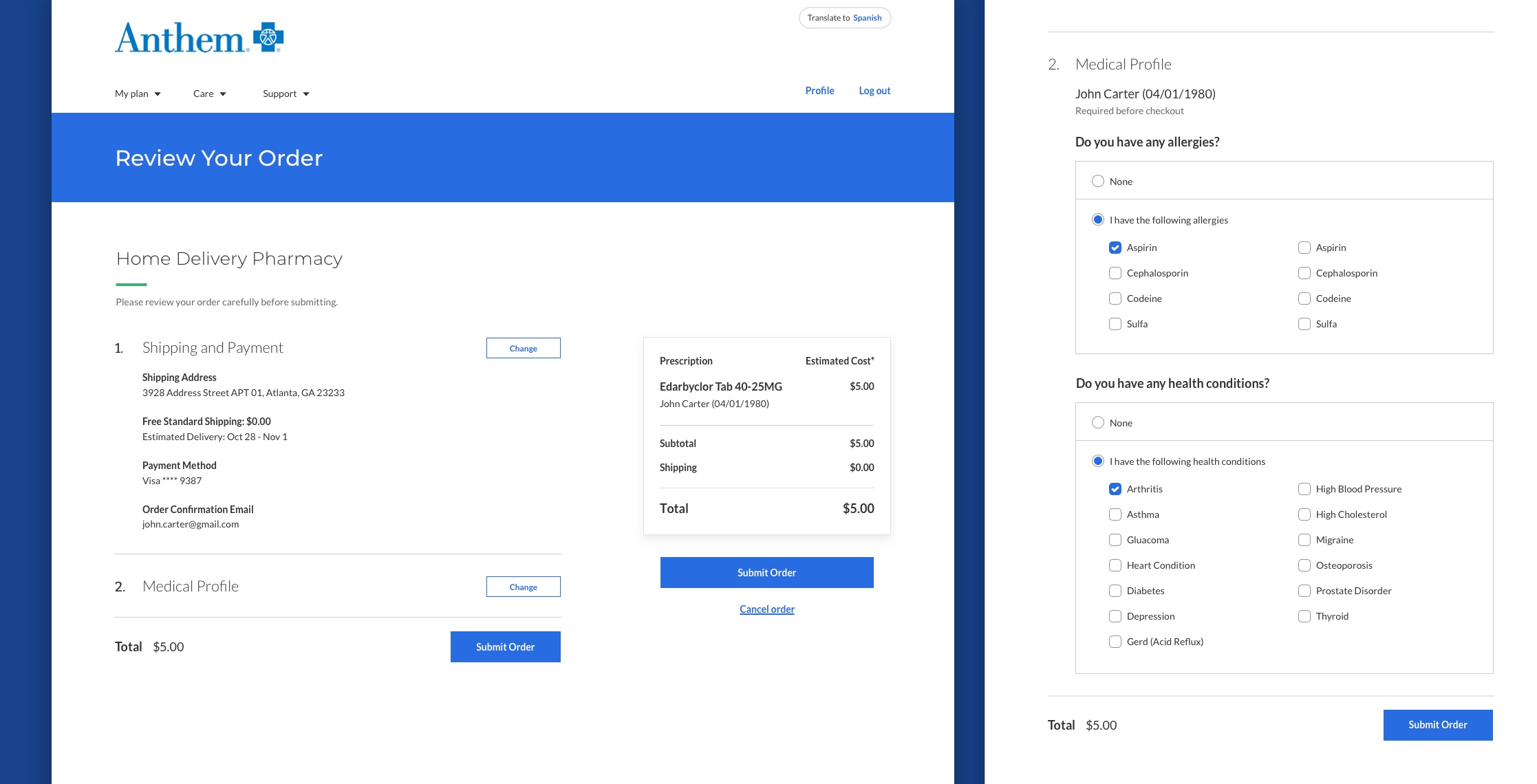
The checkout page was greatly simplified from earlier iterations, and included a simple form for users to update their medical profile.
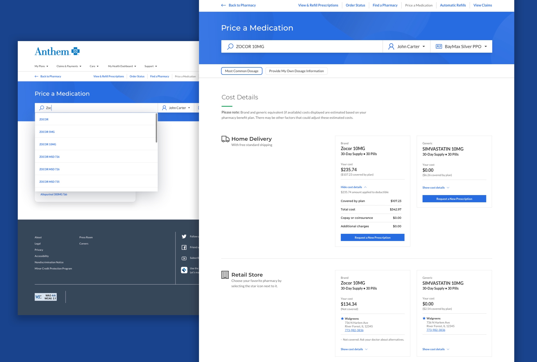
For price a medication, we ensured members could easily comprehend personalized cost information for brand or generic drugs at their local pharmacy, or request home delivery if desired.
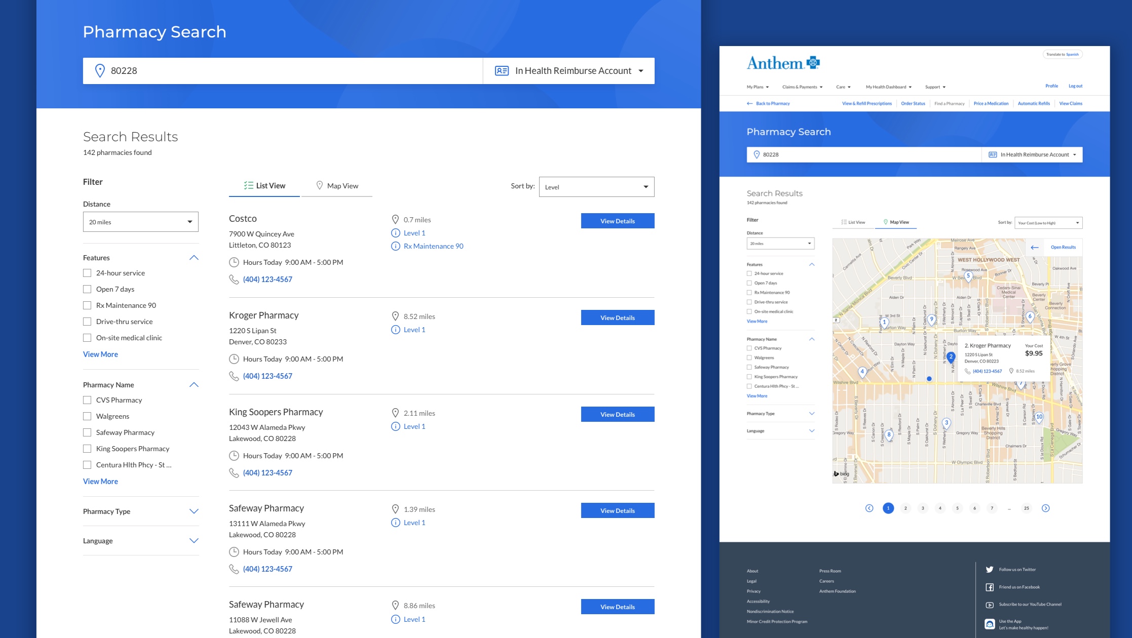
We created a UI design system that evolved in tandem with the platform. The pharmacy search was updated post launch to better align our global filter patterns while making the filter options easier to find.
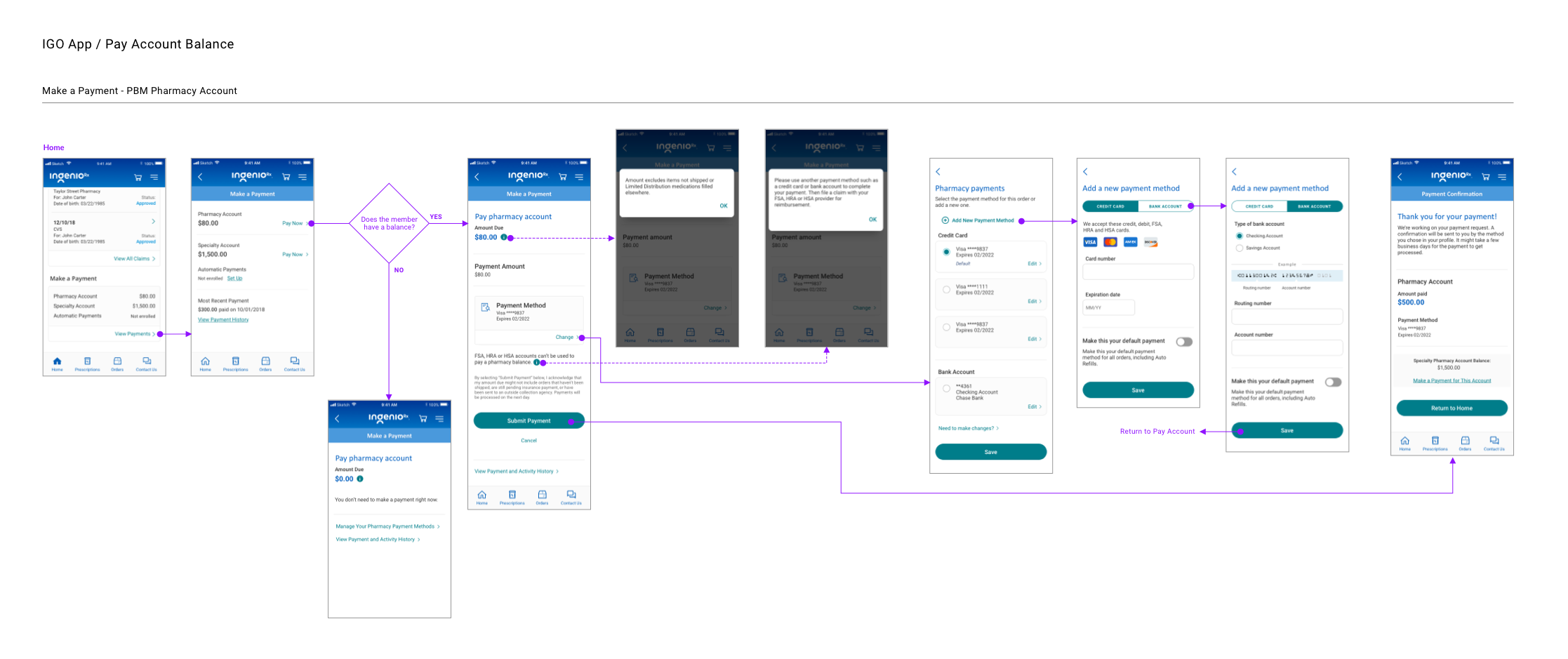
Early in the project, I generated task flows for features I was assigned to. I started with mobile and created generic patterns that could apply to any brand or platform. Anthem delivered the same PBM features to non-members via IngenioRx, enabling additional revenue.
Usability Testing
To make navigation more intuitive, I proposed a sidebar navigation to maintain user orientation during task changes. Using an Invision prototype, users completed key pharmacy tasks from the homepage, resulting in significantly improved task completion and an 82/100 quality of experience score.
Valuable insights were gathered, including ideas for future enhancements, like integrating auto refill activation in the checkout flow. With these findings I was confident that Anthem’s PBM platform would compete well in the market, rivaling both Express Scripts and emerging players like Amazon Pharmacy.
Design Restrospective
Regular retrospectives were instrumental in identifying bottlenecks, leading to continuous process improvements. Analyzing the process map, which I created, revealed the need to involve our content team and tech analysts at an earlier stage of product planning. Additionally, although we conducted usability tests actively, insufficient time was available to implement our insights. We corrected both these issues, and as a result, our revised processes significantly improved subsequent Anthem projects.
Devin Gonzales
Let's talk. Use the form on this page to get in touch. Your information is kept confidential. You can also connect with me on social networks.
This site is protected by reCAPTCHA and the Google Privacy Policy and Terms of Service apply.
